HP Scale UI: One Control Panel for 100+ Million Customers
Shipping 25+ printer programs globally through a shared design system and firmware codebase.
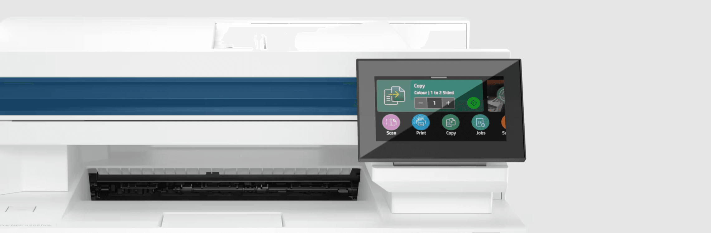
I spent four years on the screen 100 million people touch
Over four years on HP’s Control Panel UX team, I designed and shipped the control-panel experience for 25+ printers built on Scale UI, HP’s shared design system and firmware codebase. As the interaction designer for Print from USB, Contacts, and Active Jobs, I worked across five market segments and screen sizes from 2.7 to 22 inches, for a product line that reaches 100+ million customers worldwide.
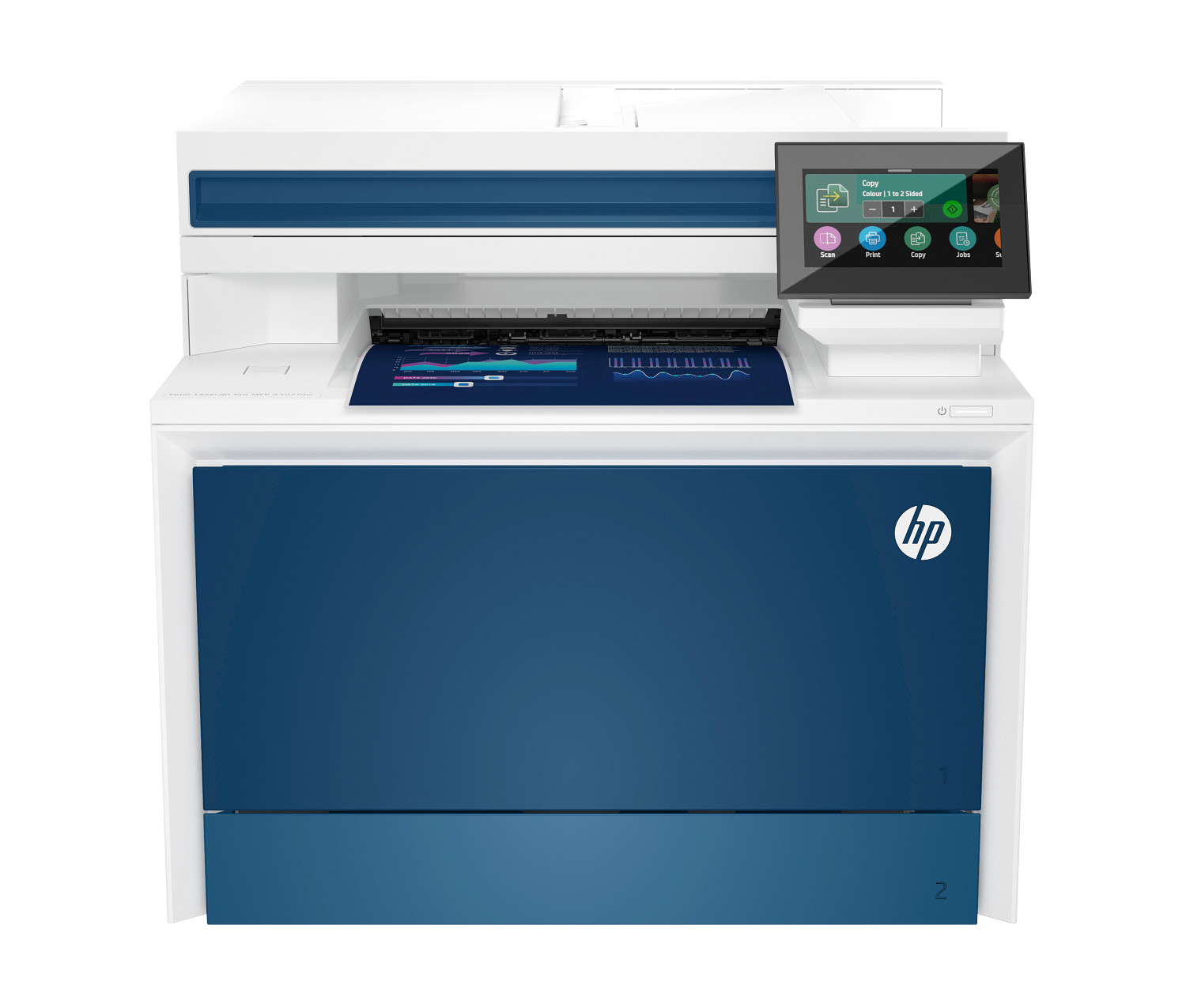
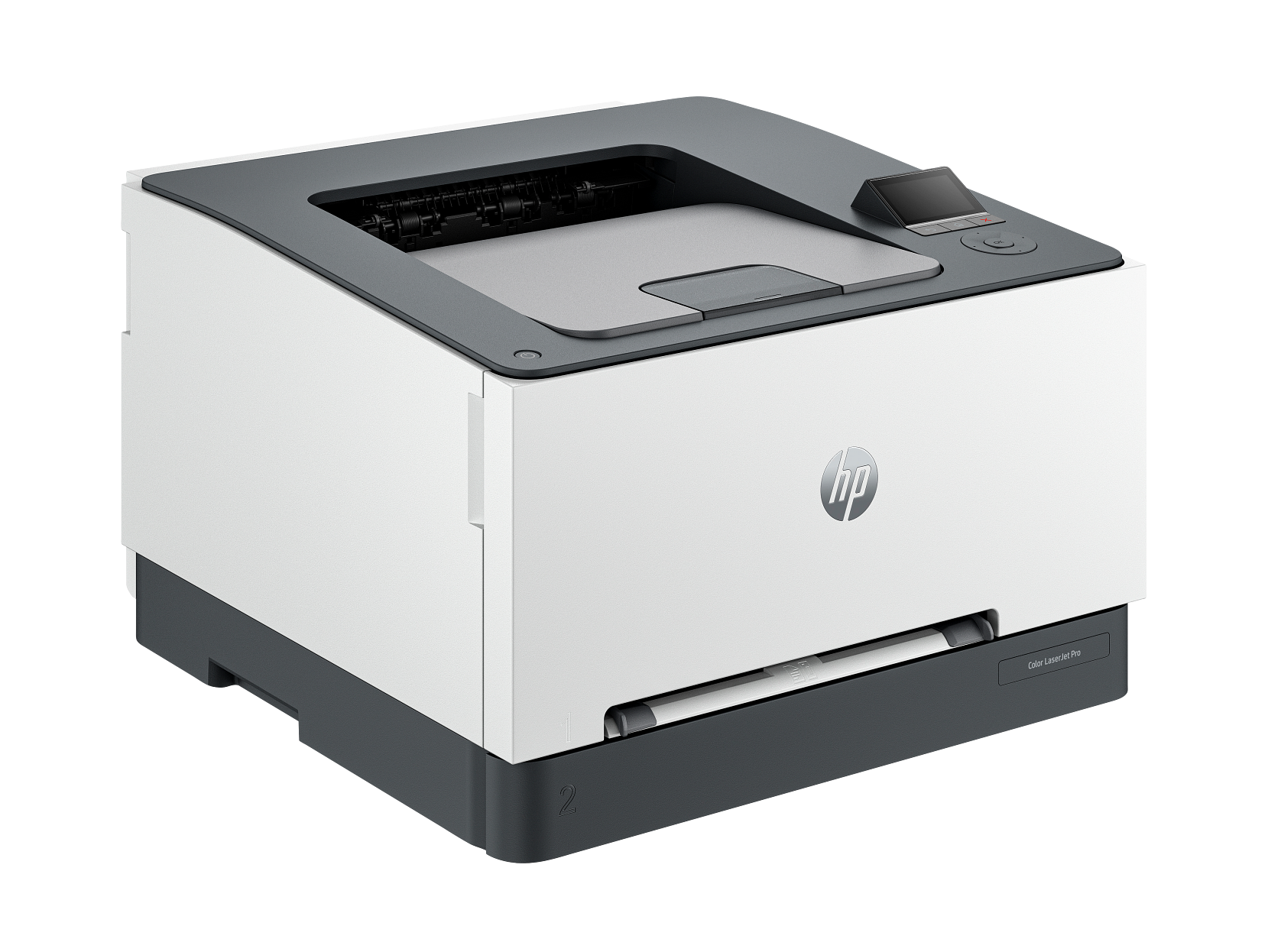
and many more, across 25+ printer programs shipped on Scale UI.
Design it once, and it ships across the entire lineup
HP’s printer lineup spans five market segments, seven display sizes, and dozens of programs shipping simultaneously across the globe. Scale UI is a proprietary design system paired with a shared firmware codebase, so that a single design decision could propagate across every program rather than being rebuilt from scratch each time.
I joined the Control Panel UX team in 2020 as an interaction designer owning three apps: Print from USB/Network/Source, the Contacts management app, and Active Jobs (Print, Copy, Scan, Fax). Those three surfaces touched the most frequent daily workflows for the broadest range of users.
The same printer lands in a home of one and an office of 250
The same physical device can land in a home office of one or a corporate floor of 250, depending on which segment it belongs to. My design file had to satisfy all of them at once. Each segment has different task priorities, hardware budgets, and IT infrastructure expectations.
One design file. Four segments. Home printers sit in apartments; enterprise units handle bank floors and government offices.
Five personas across the Home/SoHo/SMB/Enterprise segment. The target is Ella, a dual-role home consumer and office citizen. Joe (IT admin) sets up and governs the device; Wen owns the business that depends on it.
An SMB printer shared by 15-40 people creates problems that a home device never sees: multiple jobs running simultaneously, authentication tied into existing IT infrastructure, and security settings configured by an admin who may never touch the printer again after setup. A home consumer wants to print a boarding pass in three taps. The design file had to hold both realities without collapsing into a compromise that served neither.
Once it ships, it's permanent in millions of devices
Web products allow iteration after launch. Hardware does not. Once a printer ships, the firmware in that physical unit is fixed. Every interaction pattern I specified became permanent in millions of devices. This shaped the entire process.
Wide-range responsive: seven distinct display resolutions, from a 22-inch enterprise touchscreen to a 2.7-inch home panel the size of a credit card.
Unified design system: the dropdown component ships in five variants, each defined in the shared codebase. Custom additions required a formal change-management process.
Keeping design intent intact across seven teams
No single interaction designer owned the experience end-to-end. The process was operationalized: teams each handled a part and handed it forward. My job was to keep workflows compatible with predecessor products users were already habituated to, fold in product and program improvements without breaking that familiarity, and see that design intent was built as specified. Each requirement arrived from a product owner or PM. Before designing, I worked out its segment, edge cases, happy paths, predecessor workflow, and launch timing. Once designs were done, I aligned cross-functional partners so intent held without breaking interdependencies in adjacent apps, and tracked design, development, and launch timelines as separate but dependent variables.
The flow diagram was the contract
Every use case started with a Data Flow Diagram. I mapped the happy path first, then every branch: error states, edge cases, unsupported inputs, detection failures, format-not-supported screens, interrupted connections. Each DFD was validated with subject-matter experts from design and firmware before any wireframe was drawn.
Print from USB branches at nearly every decision point: is a USB inserted? Are multiple USBs present? Is the printer busy? Does the USB require a loading dialog? Were files found? Are any of those files in a supported format? Resolving all of these at the task-flow stage meant developers could build through a full sprint without stopping to ask design questions. The DFD was the contract.
Full DFD overview: folder navigation, file browsing, format-not-supported errors, search. Each blue node is a UI screen; each diamond is a decision point firmware must handle.
Rethought at every size, from 21 inches down to a credit card
Each screen was designed at three size groups: XL to M (21-inch to 8-inch), S (4.3-inch), and XS (2.7-inch). These were not scaled down from a larger frame but reconsidered at each breakpoint. Layout, content density, and navigation changed significantly across sizes because a grid that works on a 21-inch enterprise panel does not transfer to a panel the size of a credit card.
One Print from USB workflow, reconsidered across three size groups. XL (21-inch) uses a thumbnail grid; S (4.3-inch) collapses to a list; XS (2.7-inch) ships on a dark panel often driven by analog buttons. Annotated numbers map each element to its Pattern Table entry.
Visual design lived in the firmware codebase and was applied programmatically, so my deliverable was a wireframe where structure and hierarchy had to be resolved through layout and density before any color.
Inside the working files
The wireframes above are the resolved output. These are the working files behind them: the Figma grid system, the device-size component sheet, and the data-flow diagrams that mapped every edge case before development.
Every answer written down before developers could ask
Pattern Buildup Tables listed every interactive element on every screen: area, layout description, availability state, and properties. Critically, the terminology was matched to internal code repositories exactly. A developer could read a table row, look up the component name in the firmware codebase, and know which variant to use without asking.
Wireframe and Pattern Table side by side. The red circle highlights how each numbered annotation on the wireframe maps to a specific row in the table, which maps to a specific component in the firmware codebase.
Behavior Tables covered the layer beneath: constraint states (the Print button stays inactive until at least one file is selected), filter and sort logic (sort order persists across folder navigation but resets on app exit), modal triggers, and scroll behavior. Any interaction detail that would otherwise surface as a developer question in a Slack thread at 2am got resolved in the table before the build began.
Pattern Table: component names reference firmware JSON files directly (Search.json, Filter.json, Sort.json). Developers trace any element to its codebase equivalent without asking design.
Behavior Table: four rules covering the Print button constraint, filter active state, filter modal, and sort persistence. Each rule preempts a developer question.
I walked every flow on the actual printer
When development hit milestones, I loaded the build onto a physical printer and walked every flow on the actual device, not an emulator or a prototype. Print from USB: plug in USB, navigate Menu > Print > Print from USB, browse, select, configure copies and options, print. Contacts: Menu > Contacts, view list, add contact, add group, search, sort, filter. Issues were filed in Jira and tracked against the design intent until the build matched the specification.
The hardware reality sharpens why this step matters. A web product can push a fix in hours. A printer ships firmware into physical units with no over-the-air update path for most of the range. An unresolved discrepancy between design and build is not a debt to pay later. It is the product that ships.
Print from USB on a physical HP Color LaserJet Pro: USB inserted, folder structure navigated, file selected, copies configured, print confirmed.
Contacts app on hardware: contact list viewed, new contact added, search and filter demonstrated on the physical control panel.
We tested with users before the firmware locked it in
On this work I held a dual role as interaction designer and researcher. Alongside the research team, I owned the research protocol and designed the test sessions, including the stimuli participants interacted with.
Participants were recruited by market segment, split between emerging and developed markets, so sessions reflected how home, SMB, and enterprise users work across different regions. What we learned fed back into the design before the workflow was committed to firmware.
We built interactive HTML prototypes as the test stimuli, so participants could move through real workflows before any hardware was final.
A recorded user test session: a participant working through the prototype while we observed.
The same product, minus the touchscreen
The process described so far was not tied to a single product. The same method of task flows, responsive delivery, and pattern and behavior tables carried across several control-panel types, each with its own interaction model. Hybrid UI was one of them.
Hybrid UI covered the 2.7-inch home panels at the lower end of the range, which sometimes shipped without touch at all. Users navigated with a D-pad (a physical directional button) and a set of hard keys, so the same interaction patterns had to be expressed through a completely different physical input model.
I owned the interaction design for Hybrid UI separately from the touchscreen flows. Navigation hierarchy, focus states, and action sequences were rebuilt to work within the D-pad model, while staying recognizable as the same product to users who move between a home and an office device.
Hybrid UI prototype: D-pad navigation on a 2.7-inch panel with no touchscreen. Focus traversal, selection states, and action confirmation all handled through physical buttons.
The HP Color LaserJet Pro 3201dw shipped with the Hybrid UI: a 2.7-inch non-touch panel driven by a D-pad and hard keys.
25+ programs shipped, and the reviews came back best-in-class
The HP Color LaserJet Pro MFP 4301fdw, the first product to ship on Scale UI, received a 4.5/5 Amazon rating, a four-star review from PC Mag, and a best-in-class designation from Digital Trends. Across my four years on the team, 25+ printer programs shipped globally using the Scale UI system and the interaction model I helped define.
Scale UI's business case was cost, and it compounds. One resolved design file shipped across 25+ programs, so every interaction decision was paid for once and reused two dozen times — instead of each program staffing its own control-panel design from scratch. The DFDs and behavior tables carried the same logic into engineering: developers built through full sprints without design-clarification stalls, and because shipped firmware cannot be patched in most of the range, every defect caught at the table was worth multiples of the same defect caught in the field.



Covered and rated by PC Mag, Amazon customers, and Digital Trends, which named it a best laser multifunction printer.
Want to talk about work like this?
Reach Out
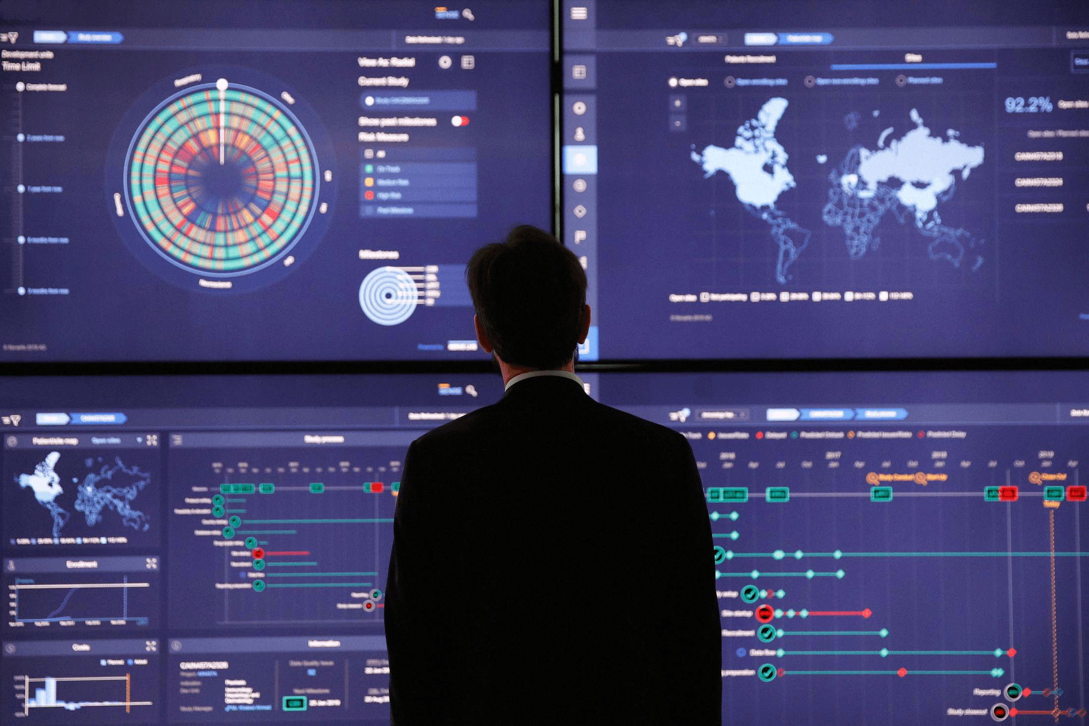 SENSE: Turning Trial Data into Decisions