SENSE: Turning Trial Data into Decisions
An analytics tool that predicts clinical-trial delays so decision-makers can pivot early.
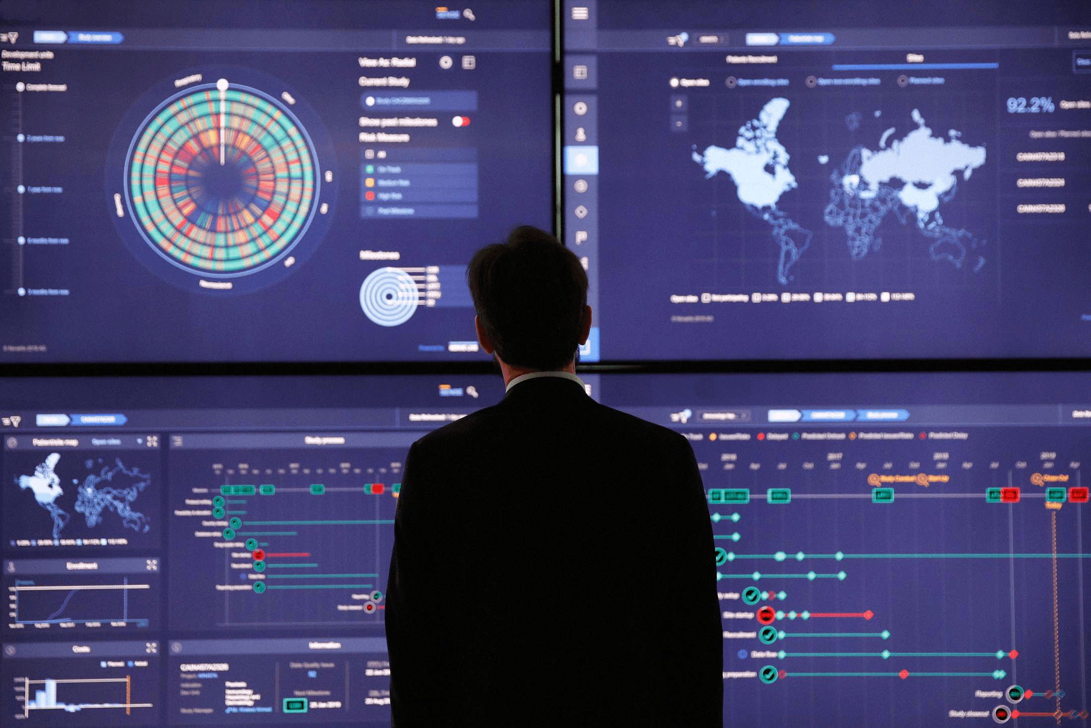
SENSE is an analytics platform that predicts clinical-trial delays before they happen, so trial directors and portfolio leaders can pivot early instead of reacting late. I designed it end-to-end, interaction and visual, as the solo designer over 1.5 years. It launched to a 2× engagement extension and Bloomberg coverage. The signal that mattered most: a user emailed the client's CEO, unprompted, to say thank you.
SENSE in motion: the finished platform across portfolio, study, process, and site levels.
An early-warning system for trials that run eight years
SENSE is a data visualization and analytics platform built for pharmaceutical clinical trial operations. It surfaces risk predictions, process interdependencies, and delay signals across active studies — giving trial directors, portfolio leaders, and forecasting managers the visibility they need to make proactive decisions instead of reactive ones.
Clinical trials run between 5 and 8 years on average. They are highly sensitive to external disruption: regulatory delays in one country, site recruitment gaps, supply chain bottlenecks, or a single missed checkpoint can cascade into months of trial extension. Every study contains multiple interdependent processes, and when one slips, the ripple effect across related studies is rarely visible until it is already too late.
I worked as a solo designer from my studio, owning both Interaction Design and Visual Design end-to-end. Our team was a Product Owner, a Development Lead, and a Design Manager from the client side at Accenture.
Current State
Trial teams learned about delays after they happened. Risk lived scattered across internal tools, interdependencies between processes were invisible, and operators, management, and leadership each saw only their own slice. A slip in one country surfaced only once it had already cascaded into related studies.
Desired State
A single place where risk is predicted from data, interdependencies are traceable, the right person is notified across operational levels, and teams can communicate to pivot before a date is missed.
Operators, management, and leadership in the same room — two days of mapping the problem space together.
Synthesizing latent needs: predict, analyze, notify, and collaborate emerged across every role.
Each latent need became part of the product. Predict risk became the dashed-versus-solid prediction language on every timeline. Analyze interdependencies became the upstream and downstream checkpoint logic. Notify across levels became the portfolio-to-site drill-down. Collaborate to pivot became commenting and sharing on the Study Summary.
Three kinds of users, three relationships to the data
SENSE serves three distinct user groups, each with a different scope of responsibility and a different relationship to the data.
Three user types across the platform, each with a different scope of responsibility and relationship to the data.
Two hierarchies that had to feel like one
SENSE organizes data across two independent hierarchies. The content hierarchy runs from a single clinical study, to a project (a collection of 8–10 studies), to a portfolio (200+ studies in the same disease area). The geographical hierarchy runs from global, to regional, to country, to individual site — the hospital or location conducting the study.
At any point in the platform, the user chooses their position in both hierarchies simultaneously. The primary workflow flows from the widest view inward: start at portfolio level to get a macro read on risk across studies, deep-dive into a specific process that shows strain, then zoom geographically from global down to a single site. The entire platform was designed to make that traversal feel continuous rather than fragmented.
Two independent hierarchies: content (study → project → portfolio) and geographical (global → regional → country → site).
From the whole portfolio down to a single hospital
Home: Portfolio Macro View
The home screen gives any user a portfolio-level read on the most important data points across all active studies. Multiple widgets display distinct data dimensions simultaneously, letting Global Portfolio Directors spot signals quickly without drilling into individual studies first.
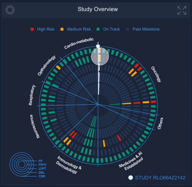
Study Overview Widget
The primary home widget uses concentric circles to represent clinical trial milestones. Each circle is a major milestone in the trial process. Within each circle, groups of five blocks represent individual trials. Users hover over a group to preview and select a study — which then filters the entire home dashboard to show data for that study only.
Study Summary View
After selecting a study, the user lands on the Study Summary View: the same widget layout as home, scoped to one trial. It surfaces the study's indication, the next upcoming milestone, and a risk summary pulled from internal tools. At the top, the Clinical Study Process widget shows a compact read on current processes and their risk status at a glance.
Process Activity Page
Going deeper opens the expanded Process Activity page. This shows the full study timeline from kickoff to trial end, all active processes, and every checkpoint mapped against the timeline. Checkpoints determine the status of the process. Throughout SENSE, a consistent visual language separates actuals from predictions: solid fills are based on real data; dashed patterns are predicted. A drug supply setup running dashed red tells a user the process is predicted to miss its date — before it does.
Process Details: Country Startup
Selecting a process opens the Process Details page. A table on the left shows overall process completion and a list of every country where the study is active, with their respective statuses. The timeline on the right maps each checkpoint with planned and actual dates side by side. Users can filter the view to a single country from the list, or switch to a full interactive map and zoom to select a country directly.
Country and Site Drill-Down
The country page lists all hospitals and sites conducting the study in that country, with a map alongside. Selecting a site opens a page with personal contact cards for site staff, the scheduled dates for five major milestones, a quick overview of patients recruited, and any issues recorded in other internal tools. This is the floor of the geographical hierarchy — full transparency on one location.
Bridge: the same product, six screens wide
As the engagement matured, SENSE was deployed as a six-screen control center at the client's headquarters. The deployment is called Bridge.
Bridge places each major data point on its own screen. Users can pin widgets from any screen and compare data points across portfolios, studies, or any level of the geographical hierarchy simultaneously. Where the web platform was built for individual analyst work, Bridge was designed for the briefing room — a shared workspace where portfolio directors could orient teams, align on risk, and make decisions in front of live data.
The same design system, visual language, and interaction patterns carry over from the individual platform to the six-screen layout without adaptation friction. Bridge is SENSE at a different scale, not a different product.
Bridge: SENSE deployed across a six-screen control center at the client's headquarters.
Built for the briefing room — orienting teams and aligning on risk in front of live data.
SENSE in the press — the Bridge control center featured in broadcast news coverage on launch.
What a Day of Delay Costs
Clinical-trial delay is one of the most expensive failures in pharma — industry estimates put a single day at $600K to $8M in lost revenue, so a missed checkpoint that cascades into a month of extension is an eight-figure line item. That is the line SENSE moves: one avoided month on one study covers years of the engagement, which is the math behind the client extending it twice.
Revenue at risk as delay compounds, priced at the conservative end of industry estimates ($600K per day; blockbuster drugs run to $8M).
The client extended twice, and Bloomberg covered the launch
SENSE launched to strong reception. The engagement was extended twice based on platform performance — an outcome that reflected the depth of adoption, not just delivery. Upon launch, the platform received media coverage from Bloomberg and was featured on Accenture's website as an example of excellence in client delivery.
The feedback that landed hardest as a designer: a user emailed the CEO of the pharmaceutical client, unprompted, to thank them for pushing the organization to build an app like SENSE. That kind of signal — a user taking time to write to leadership — does not come from a tool that merely works. It comes from something that changed how people work.
Thank you for pushing the organization to create an app like SENSE. The first time for me - in over 13 years at [Client Name] - that an app created digital happiness.
Senior Medical Advisor, Oncology. Feedback to the CEO
Two calls I'd test earlier next time
The concentric-circle study widget was the riskiest call in the project. It packs a lot of state into a small space, and while power users read it quickly once they learned it, I would now validate that learning curve with new users earlier rather than trusting that density and elegance would carry it.
I would also pressure-test the prediction language sooner. Solid for actuals and dashed for predictions felt obvious to the team, but the whole value of SENSE rests on a user trusting a dashed red bar enough to act on it before the date arrives. That trust deserves its own round of testing, not an assumption.
Want to talk about work like this?
Reach Out
 AccessWear: Designing a Circular Outerwear Service